
Designing Scroll-Stopping PPC Ad Images with Photoshop
High-performing PPC ad images grab attention in milliseconds. Analytics show that visuals with bold colors, clear text, and human faces often outperform others. This guide teaches marketers and designers how to use Photoshop to craft these high-converting visuals. By blending design best practices with performance data, you’ll create ads that stop scrolls and drive clicks.
Why do some PPC ads thrive while others flop? Data from platforms like AdStage, a PPC and advertising blog, reveals that top-performing ads share common traits: vibrant colors, minimal clutter, and strong calls to action. Photoshop is the ideal tool for bringing these elements together. Its flexibility lets you experiment with layouts, fonts, and effects to match your brand. Let’s dive into a step-by-step tutorial to create a winning ad image, plus templates to streamline your process.
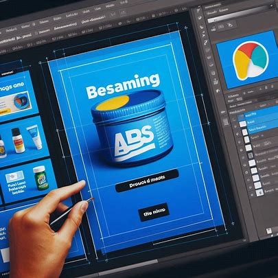
Step 1: Set Up Your Photoshop Canvas
Start with the right canvas size. Most PPC platforms, like Google Ads or Facebook, recommend sizes like 1200×628 pixels for display ads or 1080×1080 for social media. Open Photoshop, create a new file, and input these dimensions. Set the resolution to 72 DPI for web use. This ensures your ad loads quickly without sacrificing quality. Name your file clearly, like “PPC_Ad_CampaignName,” to stay organized.
Step 2: Choose a Data-Driven Color Scheme
Colors influence clicks. Analytics highlight that high-contrast palettes, like red against white or blue with yellow, perform best. In Photoshop, use the Color Picker to select a bold background color. For example, a bright blue (#007BFF) grabs attention. Layer a contrasting text color, like white or yellow, for readability. Avoid busy backgrounds; simplicity wins in PPC. If your brand has a style guide, incorporate its colors to maintain consistency.
Step 3: Add Compelling Visuals
Human faces boost engagement, according to ad performance data. Use Photoshop’s Select and Mask tool to cleanly cut out a high-quality image of a person or product. Place it strategically, ensuring it doesn’t overwhelm the ad. For example, position a smiling face on the left to draw the eye naturally across the design. If you’re advertising a product, make it the focal point with a subtle drop shadow for depth.
Step 4: Craft Clear, Bold Text
Text in PPC ads must be concise and punchy. Analytics show that short, action-oriented phrases like “Shop Now” or “Save 50%” drive clicks. In Photoshop, select a sans-serif font like Helvetica or Roboto for clarity. Use a font size of at least 24pt for readability on small screens. Add a slight stroke or shadow to make text pop against the background. Keep text to 20% or less of the image to comply with platform rules, like Facebook’s ad guidelines.
Step 5: Incorporate a Call-to-Action Button
A strong CTA button seals the deal. Create a rounded rectangle in Photoshop with the Shape tool. Fill it with a contrasting color, like orange on a blue background. Add text like “Click Here” in a bold font. Apply a subtle glow or shadow effect to make the button stand out. Position it in the lower-right corner, where users naturally look last. This small detail can lift conversion rates significantly.
Step 6: Test and Optimize
Once your ad is ready, save it as a PNG or JPEG for web use. But don’t stop there. Performance data emphasizes testing multiple versions. Create variations with different colors, text, or images. For instance, try a green CTA button instead of orange. Upload these to your PPC platform and track which performs best. Photoshop’s layers make it easy to tweak designs without starting from scratch.
Using Templates for Speed
Time is money in PPC campaigns. Create a Photoshop template with pre-set canvas sizes, color swatches, and font styles. Save it as a PSD file for reuse. For example, include layers for a background, product image, text, and CTA button. This lets you swap elements quickly for new campaigns. You can apply similar techniques to create Spotify ad graphics, ensuring consistency across platforms. Many PPC platforms also offer free templates, but customizing them in Photoshop ensures your brand stands out.
Final Thoughts
Creating scroll-stopping PPC ads in Photoshop is both art and science. By leveraging analytics, you can design visuals that not only look visually appealing but also effectively convert. Focus on bold colors, clear text, and strong CTAs. Experiment with variations and use templates to save time. With practice, you’ll craft ads that grab attention and drive results. Ready to start? Open Photoshop and let your creativity meet data-driven design!