

Everything we touch on the web now leans hard on looks. Photographers and sideline designers still flip through magazines and books for ideas, but another source—quietly buzzing in the background—is winning hearts: artist-hosting sites that let bands post tracks for nothing whatsoever.
These free musician websites refuse to be bland; they flare with quick cuts, bold colors, and layouts that seem to hum. The sneaky influence they exert on Photoshop step-by-steps is what this piece tries to pin down.
1. Fonts Big Enough to Shout
Head to any free-music domain, and you’ll spot headlines that defy the rule of subtle. Instruction sets on poster-making and cover art are now echoing that volume, nudging learners to stretch type, twist it, and plant it so it dares the viewer not to look away.
Whenever the word “drama” appears in those walkthroughs, it almost always directs you to a band’s homepage.
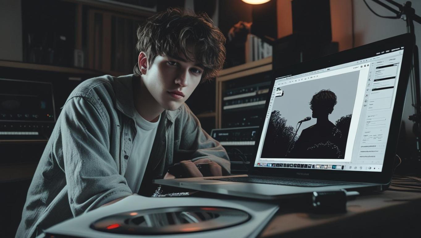
2. White Space That Lets Sound Breathe
Many solo artists simplify their pages to ensure that nothing obstructs a riff or verse, a trend that is also gaining popularity in design circles. Newer lessons now lean on wide margins, black-and-white blocks, and a single image that almost floats.
The experience often feels like stepping into a quiet cafe where an acoustic set flows and every note matters.
3. Grunge and Texture Effects Borrowed from Indie Aesthetics
Indie scenes adore the gritty, almost unpolished edge, as it immediately conveys a sense of realism. Designers utilize grain overlays, ripped-paper edges, and stray ink smudges, layering them in Photoshop until they create a flat photo that exudes a sense of authenticity.
One click can flip an average image into a bruised, hopeful collage people want to touch.
ALSO READ: From Stunning Visuals to More Streams: How Photoshop Can Supercharge Your Spotify Promotion
4. High-Contrast Imagery for Maximum Mood
Both black-and-white drama and blistering neon colors effectively penetrate the algorithm haze. Plenty of workshops now demo HDR tricks, tonal masking, and blend controls that shove the brightest lights next to the deepest shadows.
Each mood swing mirrors the ups and downs artists cram into a single three-minute track.
5. Album Art-Inspired Compositions
Template services have begun to approach band home pages as if they were massive record sleeves, creating banners that are alive even before the music starts. A handful of Photoshop guides repeat old cover rules—centering the star, letting objects spill past the edge, hiding symbols in the corners—so that web layouts whisper a story at first glance.
Sessions like those turn muscle memory into meaning and pixels into anticipation.
Conclusion
Creative disciplines exhibit a rapid recycling of ideas, which is particularly evident on the free websites independent musicians construct to showcase their work. Head there, and you will stumble across oversized typefaces, spare-grid layouts, raw paper textures, and those distinctive tight-crop frames that so many album covers use.
Designers who spend even a few minutes in that space—runner, veteran, or midnight experimenter—usually walk away with at least one fresh impulse worth exploring.